cp
©joshimerbinphotos
Objects
Still life has long been a subject of interest in art from paintings of great artists to images by iconic photographers, probably because still life objects are proofs of animate life, civilization and culture.
 |  |  |
|---|---|---|
 |  |  |
 |
Introduction to Object Photography
Still life is often easy to set up but it is rather challenging to capture an inspiring image. This introduction to object photography provides many insights on how you can easily improve your photography. If you have little time to read the lengthy explanations, you may go ahead and read the words typed in boldface.

Shot with ASUS ZenFone 5
f/2.0 1/30 sec ISO-390 3 mm Spot Metering No flash Manual
I was studying at the living room when I felt I need to take some cookies. Then I came back and realized I left the book in that position. But what makes this picture look good and familiar, yet interesting and not like a random shot? Let's analyze the image and discover some principles for better photography.
1. The vintage effect plus the HDR
ASUS ZenFone 5
8 MP

I took the image with the HDR (High Dynamic Range) Mode 'On.' This means that the camera will try to balance the light and dark areas of the scene by taking multiple shots with different exposures and combine them into one image. Without the HDR Mode, the window would be much brighter or the shadows much darker. This mode also introduces a lot of unnatural colors, making the image look really fake. That's where the 'vintage effect' comes in.


One of the great features of the ASUS Zenfone is the Gallery App's capability to instantly edit photos through filters and presets. With more than 10 filters, you can also adjust shadows, highlights, brightness, contrast, and even color curves. I chose the vintage effect for this image to acquire a better and rather interesting range of colors than that compared to the original, and the vintage impression looks fine to me.

Note: Many photo editing apps can now apply quick filters to images. Make sure that your original image is not overwritten when saving the edited one.
One powerful tool for quick post processing is Instagram's built-in editing tools. Though the image will be cropped to a square, the final result is quite impressive.
2. The Low Angle
One important lesson I learned from NatGeo photographers is shooting at eye-level or, as others would put it, to play with eye contact. A person sitting on the couch has a lower eye level compared to you if you're standing. So that's the level I'm roughly aimed at, though I can tell that I used a child's eye level for this. Can you imagine yourself as a kid? This angle is probably what you'd see.
3. Why at this viewpoint?
Choosing the angle may be easy, but to choose a viewpoint is a little trickier. Why not shoot near the table at the left? Why not a view from the top? Why shoot at landscape orientation? Why not a view a little bit from the right?
Honestly, I cannot tell from which viewpoint is the best. Each photographer has a different choice of angle, and this viewpoint works for me. But let's talk about composition and some principles of art a little bit.
A. Leading Lines. Since we're shooting at a good wide angle, it is easy to draw lines that lead to a single point we call the vanishing point; in this image, I drew four lines that lead to this common point. A tip of advice, it is actually good to have this point pointing on the subject; however, we have a different setting here. Seemingly an accidental advantage, the viewer can set to explore the other parts of the image by placing the point a little off from the subject.

Note: The vanishing point is also the eye level. We call this the horizon.
B. Rule of Thirds. Notice the image below. It's more of a technique actually. Placing the subject of interest on any point where two lines intersect makes your image less boring and more interesting. This applies to almost any subject. Whether it be a flower or a street light, the rule of thirds give life to photographs. Notice the image about 'Leading Lines' again. On which line of the rule of thirds does the vanishing point sit? We will talk about the relationship between the horizon and the rule of thirds in our Introduction to Landscape Photography.

Note: The couche's diagonal line meets the intersection at the lower left. The same is true with the pillows at the upper left.
C. The Horizontal, Vertical, and Diagonal. Why not in portrait orientation? Here's the answer:
C.1. The vertical lines in this scene are many, but most are short. That is, the vertical lines do not reach at least half of the frame and do not dominate the scene.
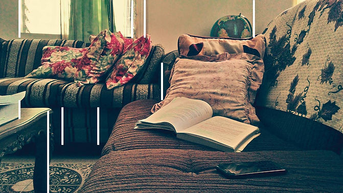
Note: Vertical lines denote strength and tallness. The portrait orientation may not be suitable for most still life images, but is appropriate with tall subjects like trees and buildings.
C.2. Here we can see the horizontal lines dominating the frame, thus the landscape orientation. One even spans more than half of the scene, and this principle comes from the line theory in art. Many still life paintings exhibit long horizontal lines, like fruits on top of a long table. Horizontal lines denote calmness and rest, and in still life composition, this is a very important element.

C.3. Diagonal lines add more motion to an image, and in this case less boring and just a little bit dynamic. I was not really paying attention to these diagonals when I took the image, and it is just surprising that they're actually playing some good parts in the photo. Notice how the four diagonals at the left are almost equally spaced? That's quite interesting.

4. 'Natural' Lighting
Light coming from a window is a good source of natural light. In this scene the light is a little bit soft, thanks to the glass diffusing the strong sunlight outside the living room. The window (two, in fact), therefore, acts as a large light source, thus the shadows don't cut clear at the edges. No camera flash is needed when taking well-lighted scenes.
Conclusion
Perhaps you're ready to ask, "Should I really remember all these things when I take images?" Well, most likely yes, but here's the click: When I took that image of the living room, I wasn't actively thinking about the leading lines or counting how many diagonals are there. I was just focused on the rule of thirds, the viewpoint and, to a little extent, the lighting. Everything else just came along, and focusing on just three things allowed me to take and compose the shot in 5 seconds.
To take creative shots require practice and experience, and you don't have to comply with every technique the tutorial may give you. In fact, great photographers are great because they make their own techniques. Howbeit, these techniques have common links with every other, thus we can say that we have a common sense when it comes to photography. Oftentimes the rule of thirds make the perfect compositions, but placing the subject in the middle by the law of symmetry can be interesting as well. By experience, you will know when to use the techniques and when to think outside the box.
Next

Why were these cakes photographed at this angle? Tap or click on the link to discover more techniques and see how easy it is to improve your photography.
To understand the tutorials better, it would be essential to learn the foundations of photography first. Tap or click on the link below to learn the basics.
Joshimer Binas Photography is the photography and imaging sector by Joshimer Binas via Bin Creatives. Showcasing personal and commissioned photography work, including wildlife-macro, still life, micrograph, landscape, architecture, research, natural history, portrait, season, creative, skyscape and astrophotography. Designed to provide quick lessons and solutions to both aspiring beginners and experienced photographers.
All tutorials in this site are free.
Copyright 2011-2015.
